CLIENT UX / VISUAL DESIGN / 2020
Grand Central Partnership
Responsive website design and frontend prototyping for Grand Central Partnership, covering neighborhood discovery, events, organizational pages, and an interactive district map.

The first InVision deck compares concepts 1A, 1B, 2A, 2B, 2C, 3A, and 3B.
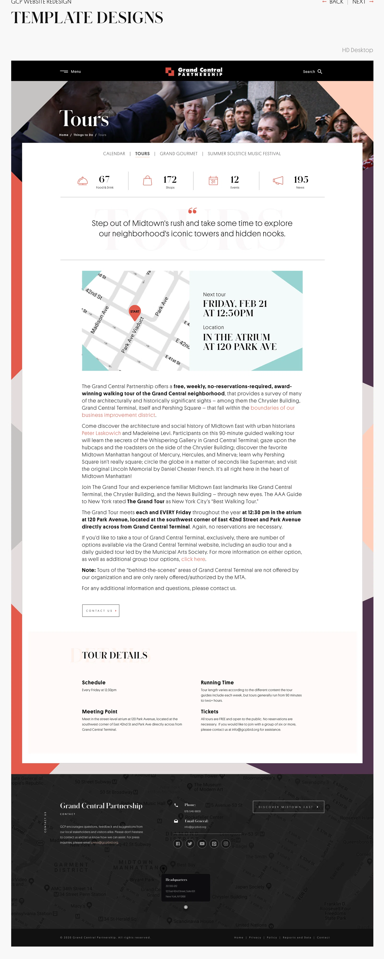
Expanded 1B page templates cover organization, reports, careers, events, tours and map discovery.
Mobile, tablet, small-desktop, desktop, and utility-state explorations.
The Grand Central Partnership website had to introduce the district and the organization behind it while also helping visitors actually use Midtown East. The design material brings together dining and shopping, neighborhood events, local news, maps, tours, organizational information, and reports.
My contribution was wireframes, UX, and visual design as part of a larger client project. The preserved InVision decks show design work, and the recovered interactive prototype shows front-end work I personally built. Neither is a claim that I independently delivered the full production website.
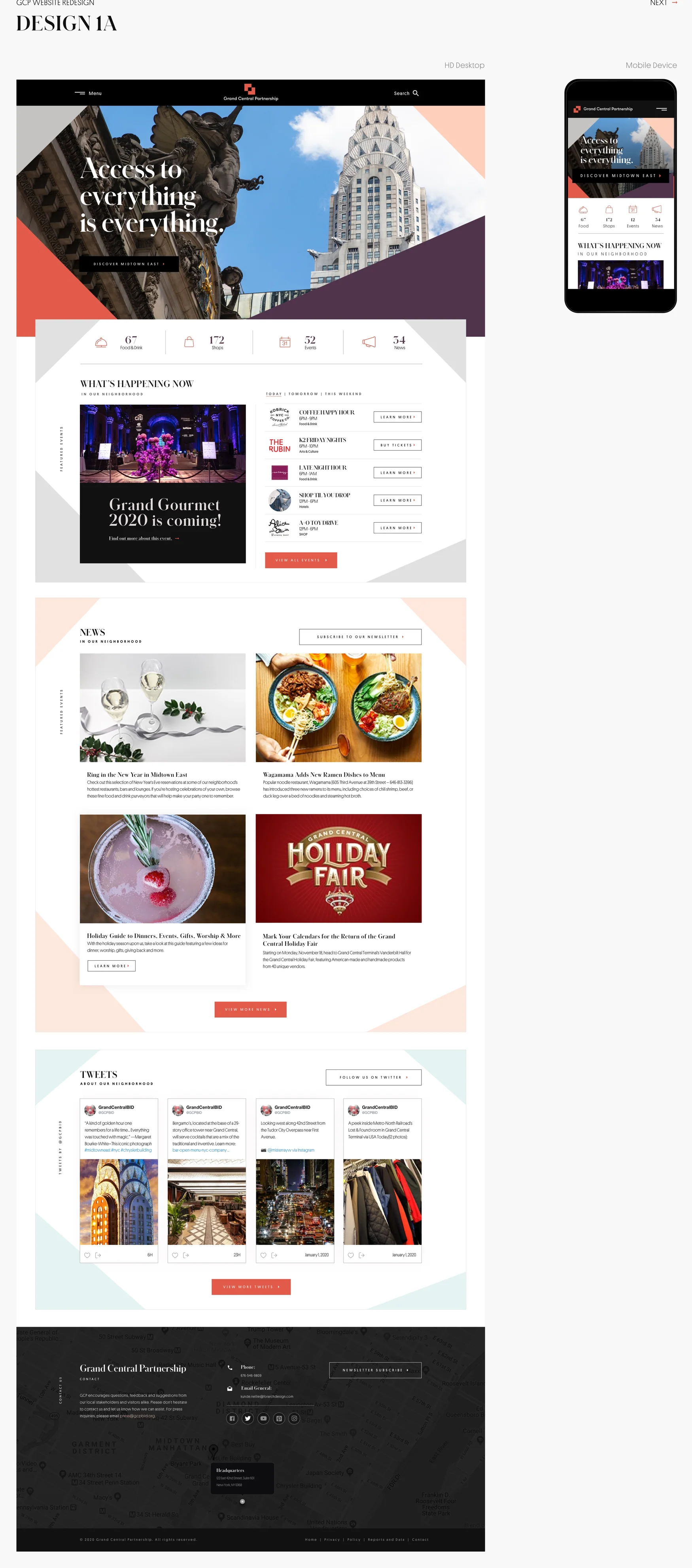
The first presentation captures several full-homepage visual routes labeled 1A, 1B, 2A, 2B, 2C, 3A, and 3B. They share a content brief but test different visual hierarchies: architecture-led graphic framing, full-bleed streetscape photography, editorial modules, neighborhood statistics, card grids, and paired desktop/mobile compositions.
Presenting the options at page length meant the design discussion could account for the entire experience, not only a hero treatment. Direction 1B was then developed further into a set of inner-page and responsive views in the later presentations.
The extended 1B presentation applies the design language to About Us, the management team, board of directors, reports and data, careers, Grand Gourmet, Summer Solstice Music Festival, tours, and the interactive map. This is where the work moves from homepage mood boards into repeatable structures for very different kinds of content.
Editorial sections, event information, downloadable research, and staff profiles need different densities and interactions, but should still feel like the same place. The designs explore consistent headers, wayfinding, content spacing, cards, and a persistent footer across those cases.
The interactive-map pages are a particularly clear UX example: people can search by keyword, browse categories such as food and drink, shopping, and culture, refine a result set, and scan both a location list and a geographic map. Rather than treating the map as decoration, the design makes it a way of finding places.
The deck shows the discovery model as a detailed interface proposal. It does not establish that its search or map behavior was implemented in the live website.
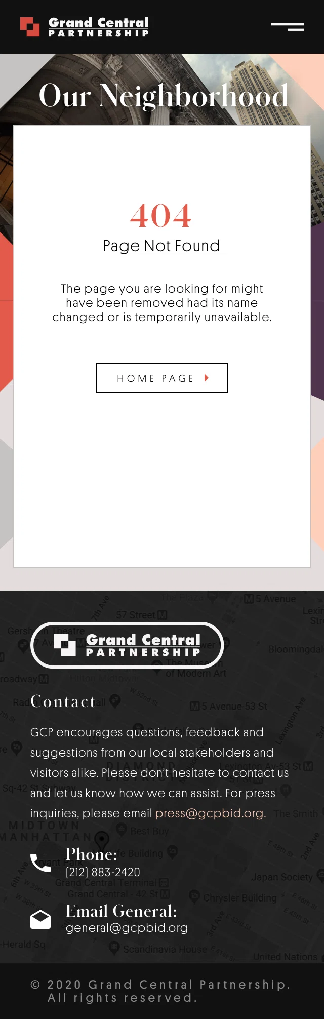
A separate responsive presentation carries the design into mobile, tablet, small desktop, and larger desktop sizes. It includes the About Us layout, management-profile overlays, the interactive map, navigation, page-not-found designs, and privacy-policy layouts.
Those aren't just scaled pictures of a desktop page. The archive shows changes in column count, content order, menu treatment, overlays, and the amount of space allotted to reading. Even the 404 and privacy-policy pages received responsive attention.
The three InVision exports are dated November 9, 2020. Together they contain seven concept screens, twenty-one expanded template screens, and twenty-four responsive screens, plus their cover pages. The files preserve a team presentation process with several collaborators credited on the covers.
I am presenting my wireframing, UX, and design contribution within that larger team effort; the archive is evidence of interface exploration and documentation, not an assertion that I personally built every screen or that every proposal became the final live product.
Alongside the screen presentations, I built an HTML/CSS/JavaScript prototype exploring the Grand Central Partnership interface in a browser. The recovered files include several page versions, navigation treatments, page content, layout assets, and PHP includes used to assemble some screens. For this portfolio I preserved the HTML version and converted the PHP-assembled views into static HTML pages, so they can open via relative links without needing a live PHP host. The archived prototype shows working front-end exploration; it is not presented as the launched site.


FULL VISUAL ARCHIVE / 11 IMAGES